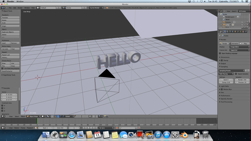
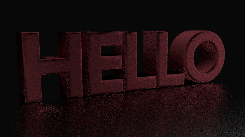
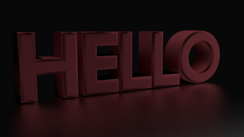
Slightly overwhelming, the software offers so much that a simple creation of text can be developed even further than I would have even imagined. Our blender workshops have been of great use to me and I am beginning getting to grips with the software. I am beginning to create texts and surfaces into which I will further develop in creating my own animated logo to use at the beginning of my other animations or simply to add to my portfolio.
Photography: Smartphones and Instagram
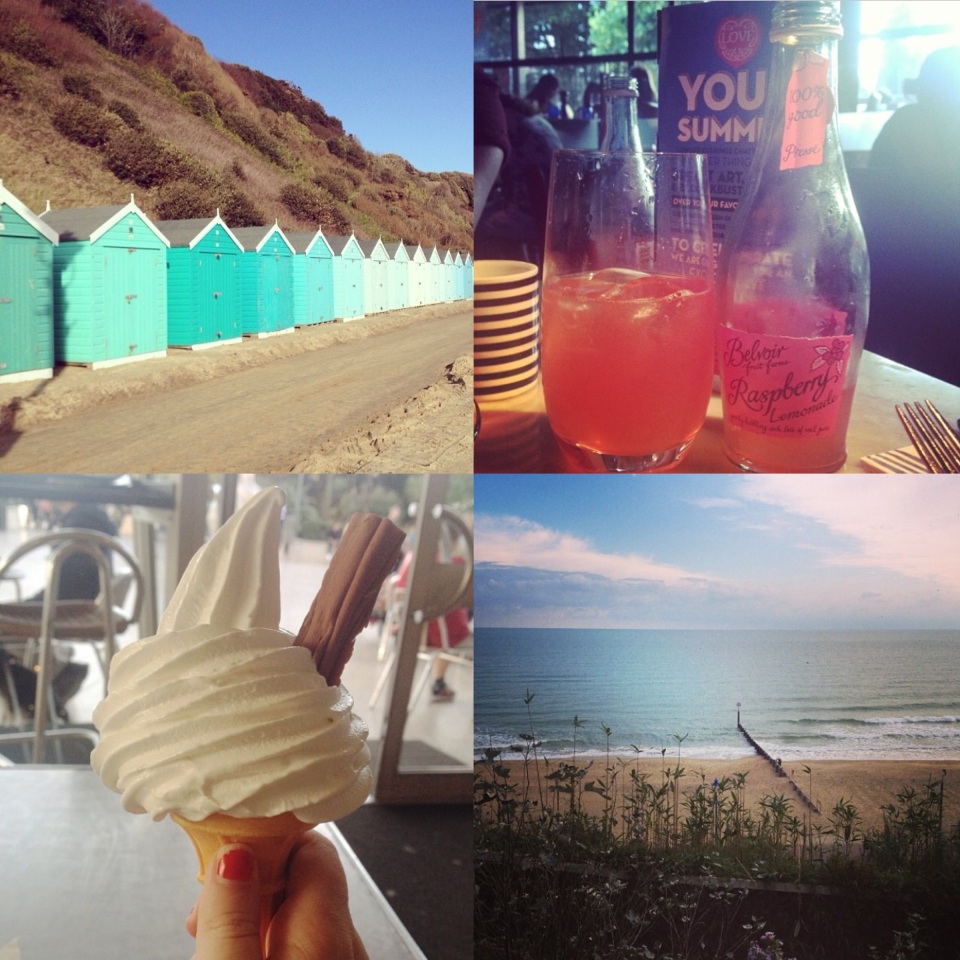
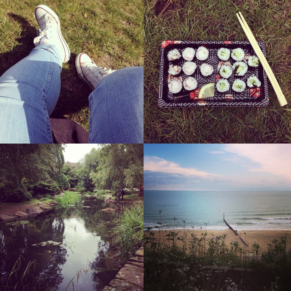
With the rise in smart phones and editing apps, more and more moments are being captured and more people are seemingly becoming interested in photography as a medium. Although some disagree that using a smartphone and instagram for fliters does not class you as a photographer and are skeptical to the rise in interest; I personally feel that a good photographer can use any camera and produce a good outcome. As previously researched, photography involves a certain eye and you can certainly capture a good photograph with a smartphone nowadays. With this in mind, I set out to capture my day at Bournemouth beach as an extension of the photography project, through the use of my smartphone and Instagram app to explore the outcomes of my photographs taken with a smartphone and then edited and documented on instagram.
Portfolio Brief: Photography Outcome
As said before, having already done this project before I was not interesting in doing it again. This is reflected in my work as it is not up to the best standards that I am capable of.
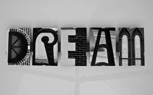
Having to take the photographs in certain angles to create the shape affects both the depth of field and rules of third which I previously mentioned which is important. The composition, although captures the letter, is not the most well thought out. Nevertheless, I am proud in capturing the more difficult shaped letters.
Portfolio Brief: Photography Interpretation
Depth Of Field:
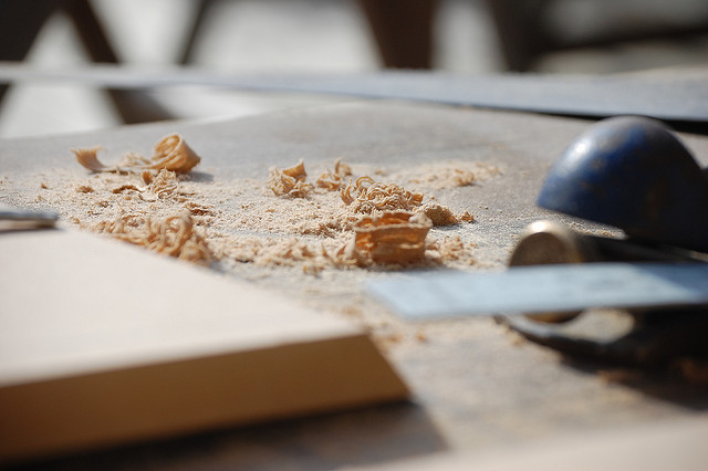
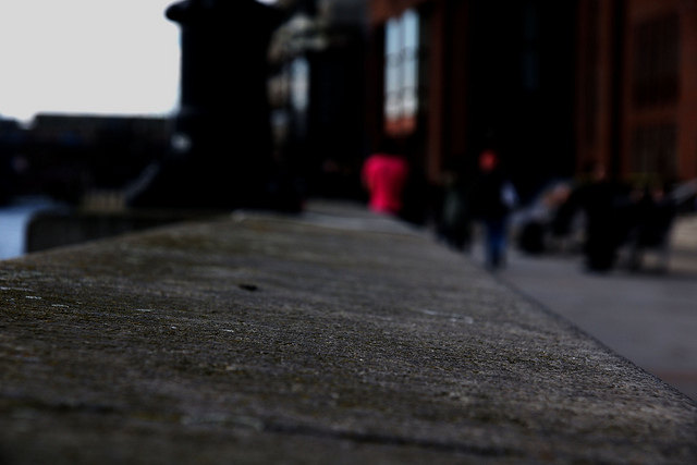
Depth of field can be incredibly effective when it comes to photography, as it can emphasize the main focus of the photography whilst blocking out the rest of the image such as the foreground and background. Using depth of field can work to your advantage incredibly and I plan to use it throughout my alphabet project.
Examples of my work that rely of DOF for the success of the image;
Portfolio Brief: Alphabet Photography Description
We were set the task in our 9AM to create letters from natural photographs. Being a big photography fan, I had done this task before and felt slightly deflated in doing it again.
Creating the alphabet through natural forms can be hard, especially when you have complex letters in your name such as G and A. However, with good photographs, the outcome can look amazing and very creative. I am quite interested in different forms, so I will try and produce letters in which are not necessarily straight forward.
Portfolio Brief: Kinetic Typography Outcome
Focusing in on a song that I enjoy, I found the kinetic typography project really time consuming yet worth it. It was interesting to take apart the words and reflect their meaning through movement, size or shape. After Effects was also a new software to me and I find key framing and the use of camera movement to be really useful and I will definitely continue to use the software and develop my knowledge in so that I am more comfortable with it, producing work that I am confident in. For this outcome, I want to create a vintage look as I felt it fit the song well and feel like I have achieved this with the font and textured background. Having the background move allows the continuously moving typography to be less stiff and I personally feel it makes the final outcome a lot smoother and more professional in terms of the technical skills. I wanted to keep the outcome simplistic yet stylish and feel I have accomplished this.
Portfolio Brief: Kinetic Typography Interpretation
Nice use of shape and connecting words that was used again in a different sentence.
The camera movement is incredibly smart and the use of images such as the gun and bullet works really well in creating a narrative alongside the song.
Although clever, I feel there is too much going on and too much is being used that it loses my interest and becomes overbearing.
Portfolio Brief: Kinetic Typography Description
Having come across kinetic typography and attempting it before, I was pretty confident in this project and was interested to explore after effects in more depth. This is as I have attempted to create a kinetic piece before however used a different software in which I do not think has the tools and ability that After Effects has to offer. Having worked briefly with After Effects previously, I was open into learning more and become more comfortable with the software to use in later briefs and own personal work.
Kinetic typography in which is the technical name for “moving text” is an animation technique using both moving text and motion to express ideas. It has seen to become more popular for things such as lyric videos and I have certainly seen an increase throughout the advertising sphere. This is as it mostly looks very neat and when well done, very creative and well thought out.
Portfolio Brief: Animation Outcome Attempt 2
As I was not happy with my first attempt, I took a different approach. I wanted to use something figurative yet still explore the shape and colour within that and decided on a hand to fill with colour to represent creativity and being artistic. The colour signifies a shot of inspiration in which begins to move with the hand and expand as the animation goes on. I much prefer this outcome and it looks more aesthetically pleasing and I would consider using this on my portfolio more so than my previous one. I feel like i have developed my animation skills through this outcome and it runs a lot smoother and realistic than my last one even though it was considered abstract. I will however continue to explore more abstract design and works more as it pushes my limits as I am not used to it and will further my work, giving me more variety in my portfolio and more of a chance in future years. I also decided on this soundtrack as the upbeat quality reminds me a lot of being artistic when I was younger as such shows as Art Attack had similar theme songs and is just a very nostalgistic sound that I relate to art and creativity instinctively.
Portfolio Brief: Animation Outcome Attempt One
Having not experimented with animation much before, I was stuck with where to start. I’m not the best at coming up with an idea quickly, inspiration normally comes at a very inappropriate time, such as a day before the deadline or whilst I’m half asleep. Keeping in mind that the notes from the lectures and the example animations were much more abstract than I’m used to, I set out to use flash for the first time.
I found it relatively easy to use, if not a little outdated, but nevertheless created something that I would not class as aesthetically pleasing.
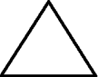
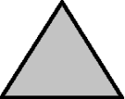
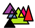
These are some screen shots from the very simple animation created in which I was exploring the use of colour within a shape and the placement/overlay of a shape. I would not consider this to be a strong outcome however I feel it was useful to learn from it and develop from it. It also gave me a chance to explore flash and see its strengths and weaknesses for upcoming projects and designs.
The use of colour and space in animation is something in which interests me greatly however using abstractly does not seem to work for me and my way of designing. I further plan to create a new animation taking certain aspects of this and developing it to something that I would consider to be proud to have on my portfolio and that is aesthetically pleasing to me.
